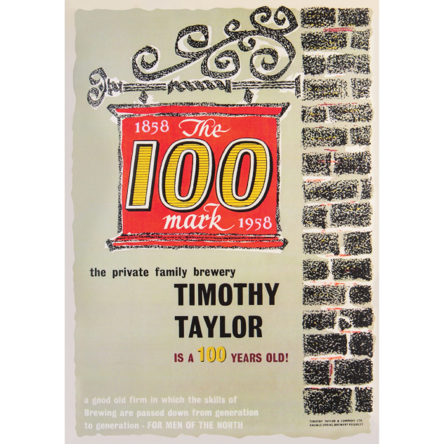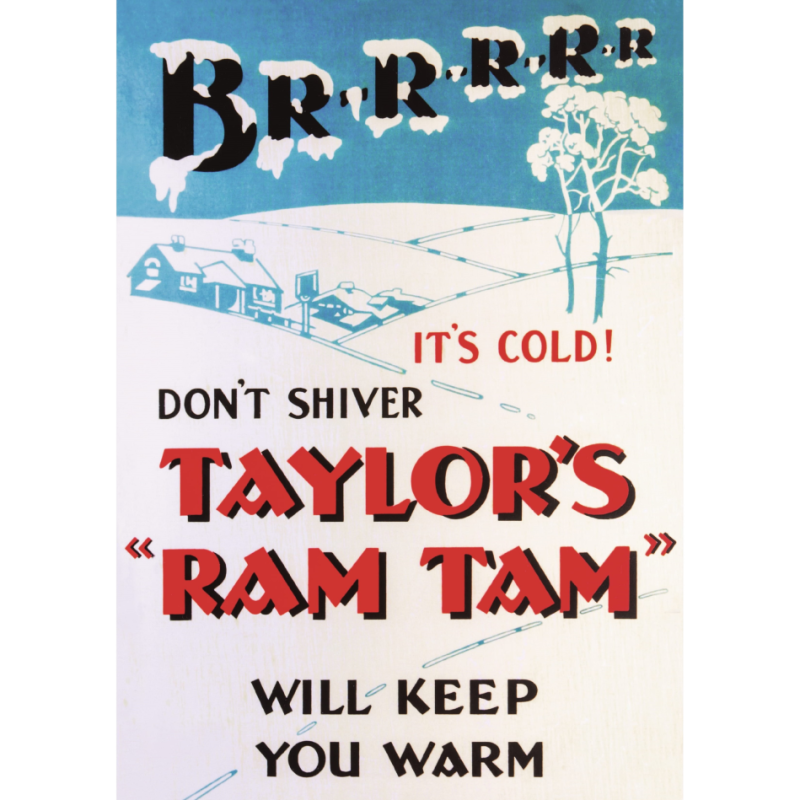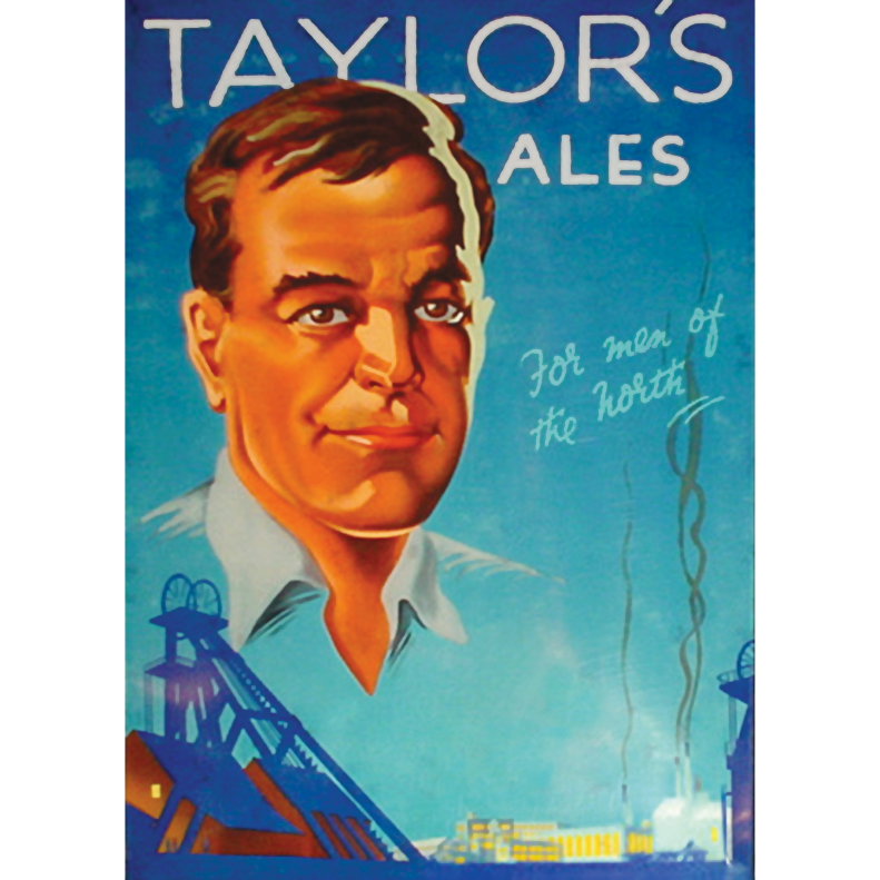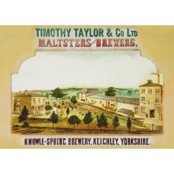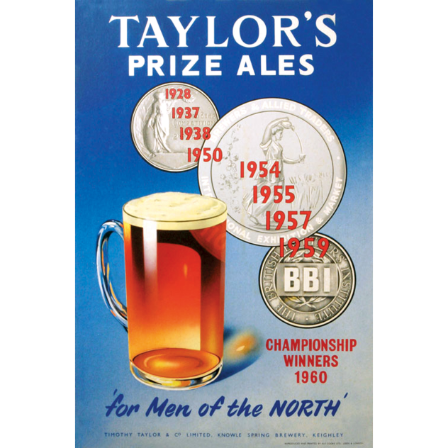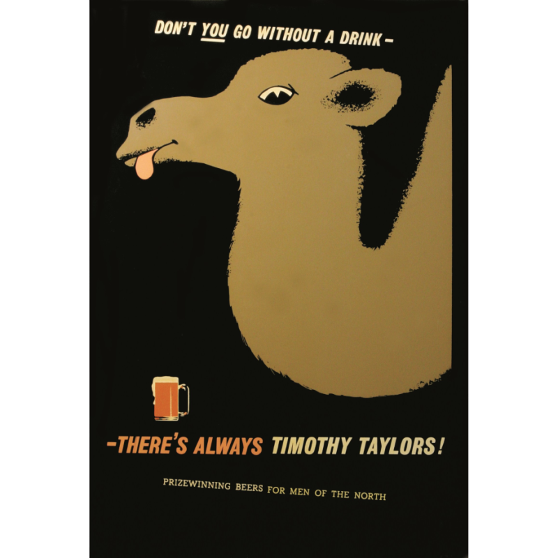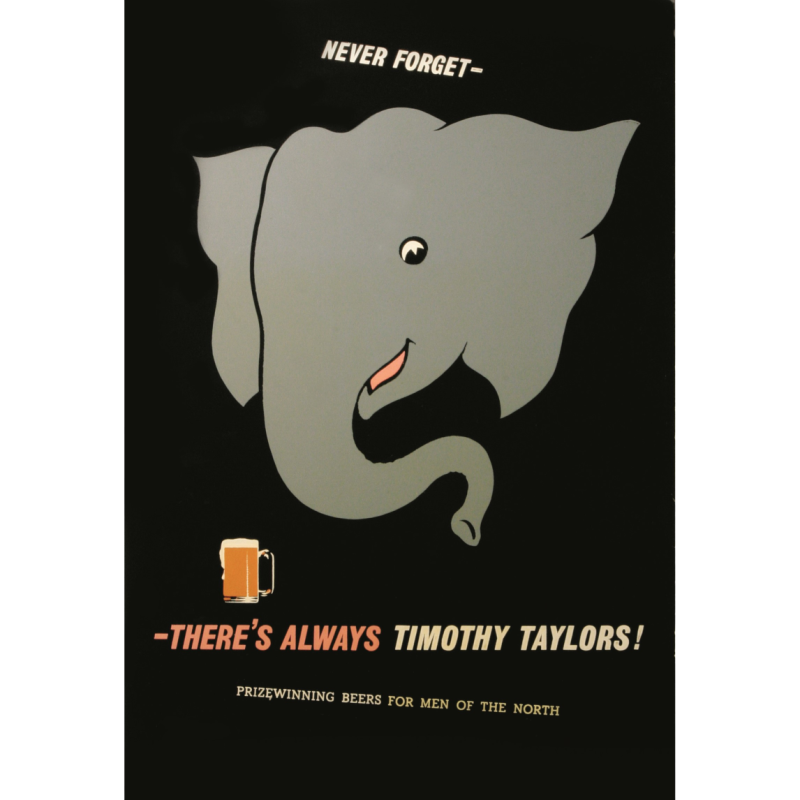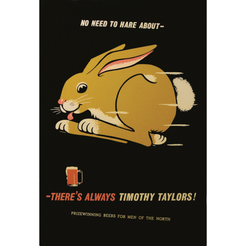

From hand-painted pub posters in the 1960s, 70s, and 80s to the distinctive illustrations of today, Timothy Taylor’s advertising tells a story that runs alongside the history of the brewery itself. Each campaign reflects its time, yet all are united by the same values: craftsmanship, character and an unwavering belief in quality cask ale.
This collection brings together decades of creativity, showing how our brand has evolved while staying true to its roots in Keighley and the pubs we’re proud to serve. It’s a different way of telling our story – through the artwork, ideas and messages that have helped shape how Timothy Taylor’s has been seen, remembered and enjoyed over the years.
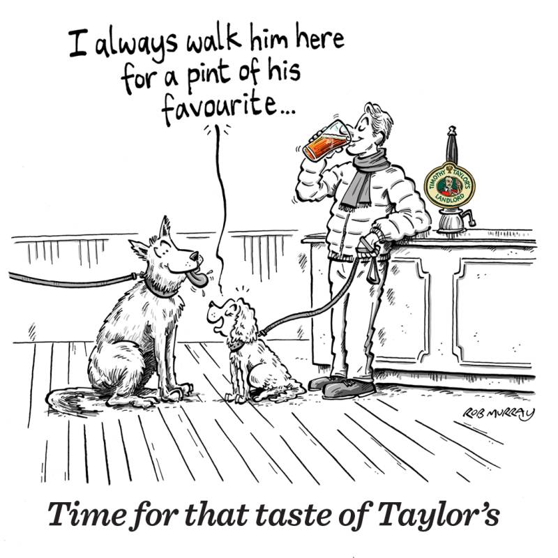
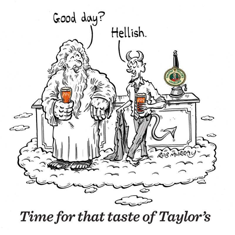
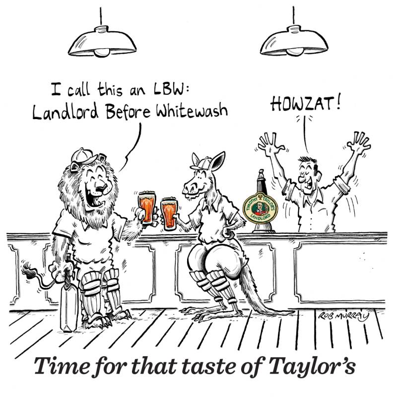
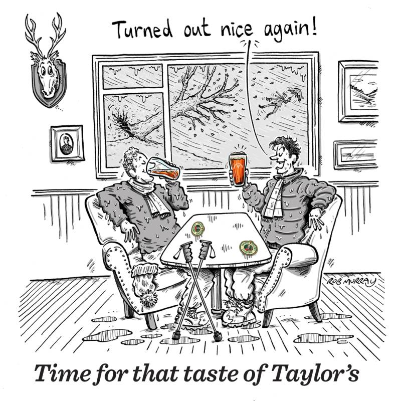
Time for that taste of Taylor’s celebrated the small but meaningful moments that lead us to the bar – the post-dog-walk reward, the welcome refuge from wind and rain, the laughter of a Christmas do with workmates. Through characterful illustration, drawn by the wonderful Rob Murray, each scene captured the quiet rituals and shared experiences that make a pint of Taylor’s feel perfectly timed, every time.
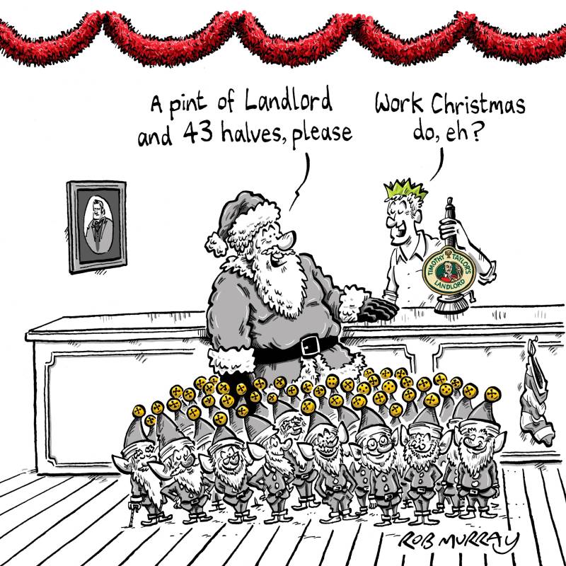
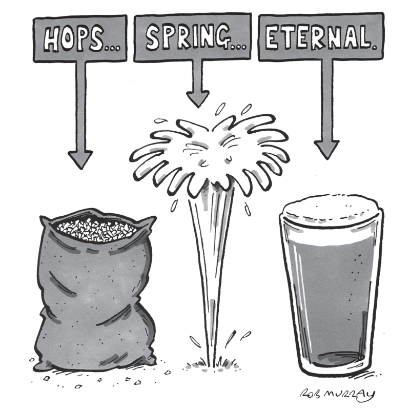
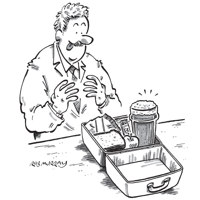
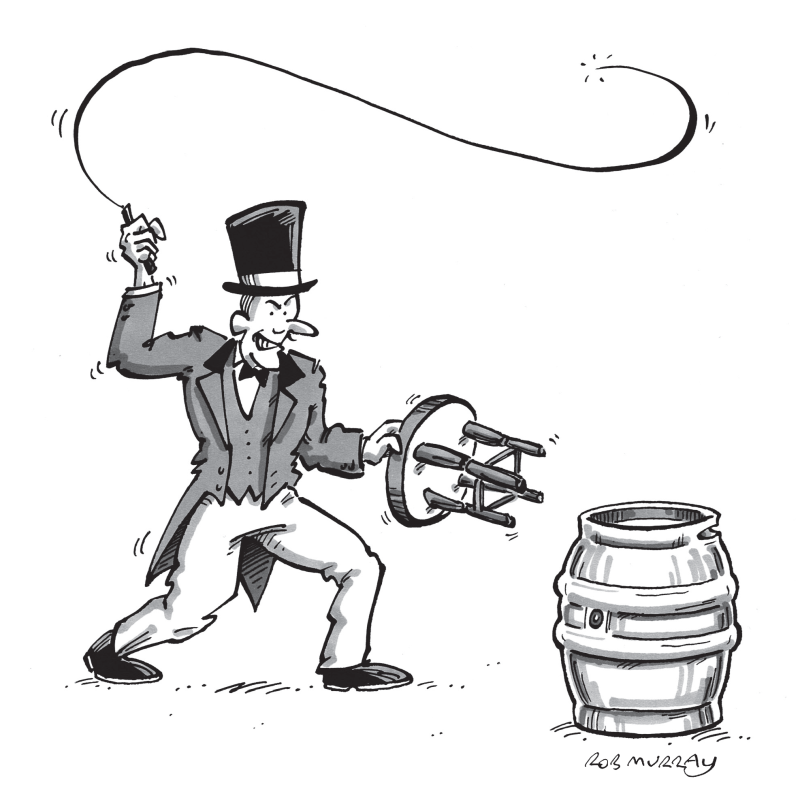
All for that taste of Taylor’s shone a light on the details that make Timothy Taylor’s unmistakably itself, from the carefully chosen ingredients and the people who grow and handle them, to the time-honoured brewing process that shapes every pint. It celebrated the quirks, stories and moments of humour that have built character into the brewery over generations.
Alongside this, the campaign gave space to the voices of our drinkers, sharing real stories of loyalty and love for the beers they know so well. Together, they formed a portrait of a brewery where craft, care and character all exist for one reason: that taste of Taylor’s.
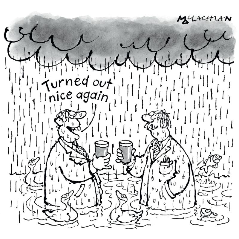
The illustrations were lovingly created by Rob Murray and the late, great Ed McLachlan.


The pub posters of the 1960s, 70s and 80s captured a golden era of British brewing, when bold typography, hand-drawn illustration and simple humour brought our beers to life on pub walls across the country. They reflected not just changing styles in design, but a growing confidence in Timothy Taylor’s identity and its place at the heart of pub culture.